
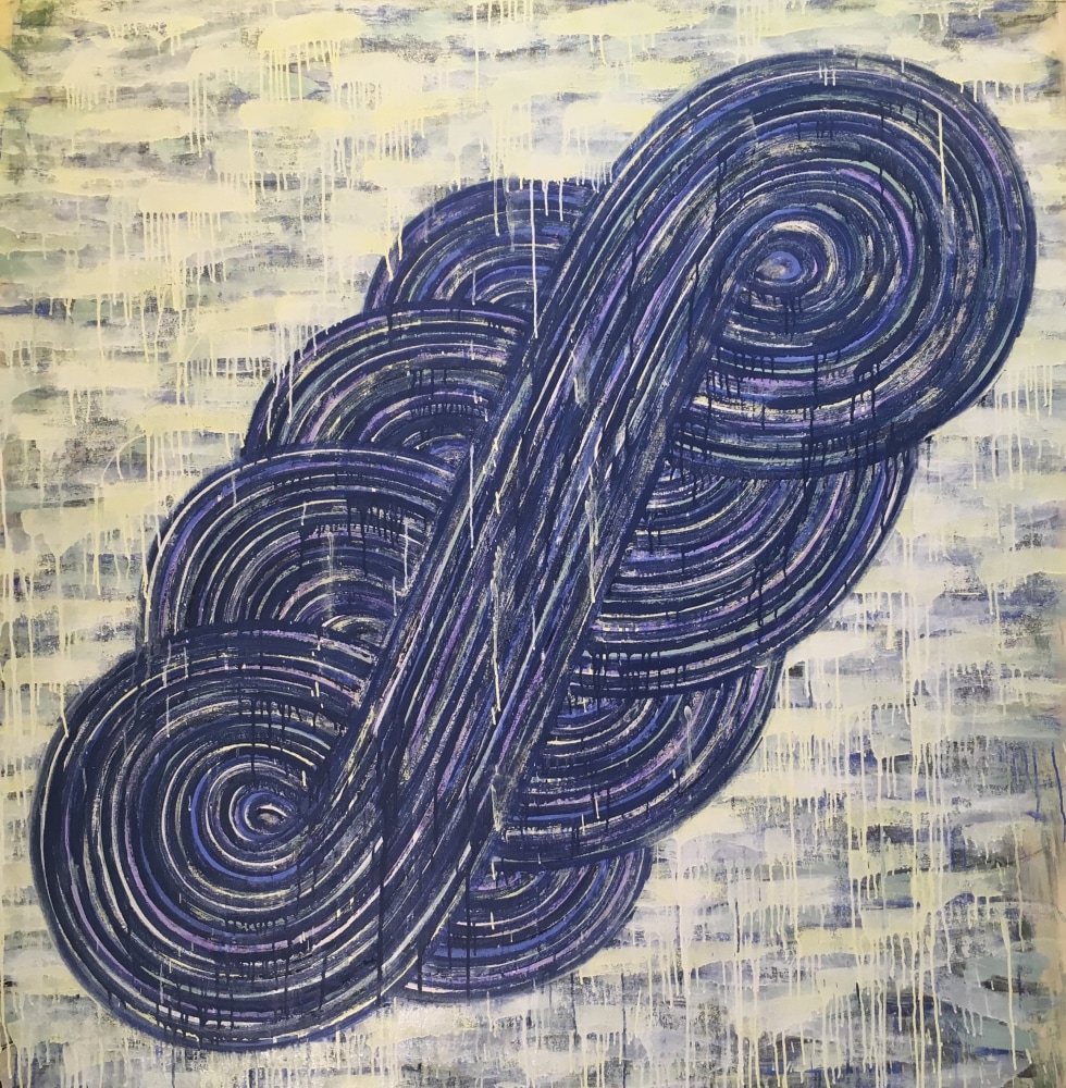
WHIRLPOOL #2, 2017
acrylic on canvas
62" x 61"
The recent exhibitions at Hemphill Fine Art are about putting in the time. It is likely most people don’t consider artists as ones who punch clocks to produce work. This is an exhibition that dispels the myth that an artist must be moved by some unforeseen “inspiration” as the modus operandi behind how an abstract artwork gets made.
In the case of Steven Cushner, the exhibition title, Double Down presents a cocksure view of the artist’s discipline in the studio. He’s productive—according to Hemphill’s press release—and with every exhibition he has, there is enough work for two. So they decided to split his exhibition in half and present two “winning” exhibitions. Irrespective of the sloppy blackjack metaphor, Cushner tends to be a safe bet when it comes to his studio output, and the attempt to double-up certainly wasn’t a risky gamble.
Cushner is a painter’s painter. While the contents of any painting are simple and inoffensive, certain elements within the paintings’ structures are seductive. There are the echoing means by which his iconographic tokens are drawn onto the canvas, often with repetitive marks radiating from a common axis or center. There is the building of values in the background, each competing to obscure what’s behind it, in an impossible game of peek-a-boo. But it’s what’s between the foreground token and the background color field that makes Cushner’s work so appealing: the fight each mark of paint makes.
For instance, in “WHIRLPOOL #2,” the background brush strokes repeat, each traveling nearly the same length across the canvas. Cream marks block out and drip over earlier marks of lavender, and whatever else is beneath that. In fact, they drip on top of the S-shaped “whirlpool” token that sits on the background: cream dribbles falling over top of concentric blue and purple rings and parallel lines. Then again, dark purple drips also cascade down the canvas, traveling into the background, where the cream background marks have been applied, or reapplied, to edit them out.
The textures and marks compel the viewer to pull the painting apart to figure out how it is made. And to pull apart the making of the work invites a barrage of questions: Which marks are by accident? Which are self-conscious correction? Which are deliberate efforts to imitate accident? Each painting possesses such paradoxes.
In terms of each half’s individual strength, the second half of Double Down is the lamb to the lion of the first half (which closed Feb. 17). Six acrylic paintings and three watercolors adorn the walls. Technically, there are more acrylic paintings in the second half than in the first half, which presented only five. But the wonder of the first half was the playful wall dominated by 58 small watercolors: sketches produced over the last 16 years that spelled out the direction of future canvases in terms of color structures and tokens (most recently of fans, waterfalls, ellipses, sausages, and squiggles) that Cushner typically works through. They also presented an immediacy that the later, much larger acrylic paintings don’t: the difference between sweet bites, and a savory meal.
In the back gallery, six works by Willem de Looper grace the walls. De Looper, who died in 2009, was another artist who put in the time, religiously painting when he wasn’t working his way from museum guard to chief curator at The Phillips Collection over 28 years.
Displayed are three larger canvases, typical of work that you might find at The Phillips Collection: Stained bands of color stretch horizontally across the surface of each painting. None of the bands possess solid values, instead they undulate between darks and lights, like the values in a moving fog. Atypical of what we normally associate with color school stain painting, there are no high-key colors in this exhibition: Composed of mostly earth tones, even a painting of mostly reds and oranges feels muted.
The mark making isn’t strictly limited to overlapping stains. There are clear daubs of paint, as if he pressed the nozzle of a paint tube against the surface of the canvas, and squeezed paint directly from the tube, dragging it horizontally to echo the direction of the striations.
The series of work was inspired by a trip the artist took to the Grand Canyon in 1972, a year before two of the untitled works were executed. In the studio, de Looper attempted to recreate his experience at the national park: that of shifting light against striated rock. Unlike other paintings in his oeuvre that touch on color field or geometric abstraction, in many respects these paintings function more in the tradition of landscape painting.
The large paintings are paired with three smaller works on paper. Compositionally, the horizontal paintings on paper immediately evoke landscape and—in at least two compositions: “Lost Cache Series, No. 6,” and “Lost Cache Series No. 5”—the relationship between land, sea, and sky. Painted with a roller, the surface texture marbles and streaks in a manner that invites closer study.
Perhaps it’s with the back gallery that the blackjack metaphor behind Double Down doesn’t seem as ham-handed as it first appeared. On the strength of the cards dealt by Cushner’s twin exhibitions, de Looper takes the house.