
The forms of mid-20th-century art and architecture are all around us, yet, these days, they lack a certain something. Call it purpose, purity or monomania, it’s the impulse that led to architect Louis Sullivan’s dictum that “form follows function” and critic Clement Greenberg’s celebration of abstract expressionism’s “ineluctable flatness of the surface.”
Architects continue to design glass boxes, and painters are still covering large canvases with nonrepresentational fields of color. But those boxes are sometimes massed in ways that seem almost Victorian, while imagery has seeped into paintings rooted in Greenberg’s “post-painterly abstraction.” For a large example, see the Corcoran’s “Chris Martin: Painting Big”; Martin’s abstract canvases incorporate collage, likenesses and surfaces that are downright lumpy. For a smaller example, there’s “Pattern: Three Generations of Shape and Color” at downtown’s unobtrusive Carroll Square Gallery. (Invisible from the street, the space is at the rear of an office building lobby.)
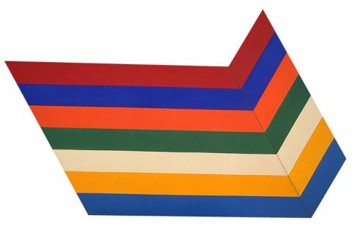
“Pattern” addresses the link between ’60s abstraction and its present-day descendants by placing a 1967 work at the show’s center. It’s “Fold Latitude,” by Thomas Downing, one of the Washington Color School’s lesser-known members. The painting, which bends broad stripes of bold color on a shaped canvas, is an off-kilter variation on the “Chevron” paintings of the artist’s more-celebrated contemporary, Kenneth Noland. Downing, who died in 1985, didn’t wander far into uncharted territory.
This exhibition is not meant to inspire a reappraisal of Downing. The focus is on two artists of younger and much younger, respectively, generations. To the right of the Downing painting are three by Tom Green, a District art veteran whose work is sort of abstract but not purely so. To the left are six paintings by Linling Lu, a Chinese-born Baltimore artist who has just completed a master’s of fine arts. (Her work will be included next month in Conner Contemporary Art’s annual show of recent area art-school grads.)
Green was once known for his black-and-white paintings, and he’s still making them — but now with color. These three canvases are covered with black forms that suggest hieroglyphics, arranged neatly in rows as if in some sort of text. If you look closely, you’ll see that each one is outlined in white (that is, by unpainted canvas.) But the areas between the symbols are filled with lightly brushed-on paint in a single (and bright) hue. “So Be It” is mostly red, “About” is primarily blue and the title of “In Green” is accurate.
Lu’s “One Hundred Years of Solitude” paintings come closer to the Washington Color School model. They’re circular, with narrow bands framing large fields. The format is akin to Noland’s “Target” paintings, but Lu’s work is glossier and hotter, with day-glo hues. Four of these canvases, grouped together, use an identical strategy, leaving the main expanse of color at the center.
Separated from the others, “One Hundred Years of Solitude, No. 9” illustrates how a small shift in a minimalist composition can have a dramatic effect: It positions its circles in the middle of the picture, defining a large color field both at the center (red) and around the outside (fuchsia).
Then there’s the one Lu painting that would have been, at the time of “Fold Latitude,” heretical. Although highly stylized and lacking any illusion of depth, “Theandric Idol” clearly shows a face. It’s not about the ineluctable flatness of the surface.
Green’s and Lu’s works share much with Downing’s. All use large expanses of color, thinly applied to display the texture of the canvas. But the younger artists reintroduce something of what was so zealously stripped away during the previous century. If that’s a perversion of modernism’s idealized forms — well, purity can get boring after a while.